Sherwin Williams 2024 Color of the Year: Upward SW 6239

Every year, the interior design and home decor world eagerly awaits the announcement of the color of the Year. This announcement sets the tone for the upcoming year's trends and influences how we style our living spaces. For 2024, Sherwin-Williams has selected Upward SW 6239 as the Color of the Year. This soft and serene shade is as versatile as it is unique. In this blog post, we'll explore Upward SW 6239 and how to incorporate this delightful color into your home.

The Allure of Sherwin Williams Upward SW 6239

Upward SW 6239 is a delicate shade of blue that exudes serenity and tranquility. It's a color that instantly soothes the mind and evokes a sense of calm, making it an excellent choice for your home or workspace. The name "Upward" suggests a sense of positivity and hope, and this color truly encapsulates those feelings.

Upward is a cool toned, muted blue with gray undertones. This color pairs well with neutrals because of its soft, subtle hue. Upward has an LRV, or Light Reflective Value, of 57. Meaning this color reflects and bounces more light than it absorbs. A general rule with LRVs is it the number is above 50, it’s a lighter brighter shade. If the number is below an LRV of 50, it will be a deeper, darker shade.

Now that you’ve been acquainted with Upward, lets talk about ways you can use this color in your home.

Create a Peaceful Bedroom

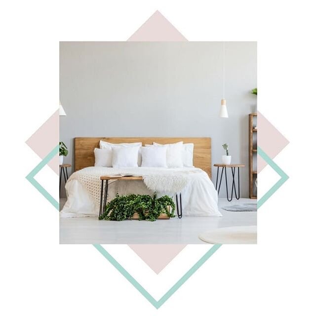
One of the most effective ways to incorporate Upward SW 6239 into your home is in the bedroom. The soothing blue tones of Upward create a serene atmosphere, perfect for unwinding after a long day. You can use Upward as a paint color for all four walls in your room or use this color as an accent with a complimentary color to offset it. Using this tranquil color on the walls of your bedroom is not the only option you have. You can also use Upward as an accent color for your bedroom furniture such as your dresser or wardrobe. Pair it with crisp white linens and natural wood furniture for a fresh and inviting look.

Primary bedroom painted with Sherwin Williams Upward

Image via Sherwin Williams

Calm and Cozy Living Room

Upward also works beautifully in the living room. Combine it with neutral tones like grey, beige, or cream for a cozy and inviting space. Add some plush throw pillows and a comfy sofa to complete the look. This color will make your living room a perfect place to relax, entertain guests, or enjoy quiet evenings.

Serene Bathroom Retreat

Bathrooms are another area where Upward SW 6239 can truly shine. The color brings a spa-like ambiance to your bathroom, turning it into a personal retreat. This calming hue creates a peaceful atmosphere for your daily self-care routines.

Photo of bathroom painted with Sherwin Williams Upward SW6239

Image via Sherwin Williams

Enliven Your Kitchen

While Upward is often associated with relaxation and mainly used in bedrooms and bathrooms, it can also work wonders in your kitchen. Use this soft blue for your kitchen cabinets or backsplash to add a touch of serenity while maintaining a fresh and lively atmosphere. Complement the blue with white or light gray countertops, and add some green plants or colorful accessories to create a balanced and inviting space.

Kitchen with cabinets painted in Sherwin Williams Upward. Kitchen sink with gold faucet under window with sun shining in. Vase next to kitchen sink with greenery in it.

Image via Grove Restorations

One Room Virtual Organizing Package

Organize your space with the guidance of a professional organizer. The One Room Virtual Organizing Package Includes:

  • Introductory video (or phone) consultation

  • Virtual Organizing Package for client to follow

  • Follow up phones to check out progress

  • Access to professional organizer should any questions come up

  • The guidance of professional organizer throughout entire process

Inspiring Home Office

For those who work from home or need a creative space, Upward SW 6239 can be an excellent choice for your home office. This color promotes focus and concentration while maintaining a serene environment. Paint your home office walls in Upward and add some stylish and functional furniture for a productive and aesthetically pleasing workspace.

Home office painted with Sherwin Williams Upward

Image via Plan Home

Sherwin-Williams' Color of the Year for 2023, Upward SW 6239, is an alluring and tranquil shade of blue that can transform your home into a calm and inviting sanctuary. Whether you use it in your bedroom, living room, bathroom, kitchen, or home office, this soft and peaceful color will elevate your home design and create a space that promotes relaxation and well-being. Invite more positivity into your home with Upward SW 6239 and enjoy a more peaceful and beautiful living space.

How will you use the Sherwin Williams 2024 Color of the Year in your home? Comment below.

The Best Farmhouse Style Paint Colors

Skeen Concepts is a participant in the Amazon Services LLC Associates Program, an affiliate advertising program designed to provide a means for sites to earn advertising fees by advertising and linking to Amazon.com

Choosing the right paint color is a tremendously important step in creating the farmhouse look that you want for your home. With so many colors to choose from, it’s hard to hone in on the right color or colors for your home. Taking into account the style of your home, size of rooms, etc. it can be an overwhelming decision to make.

Luckily, you’ve got us, the Skeen Concepts Design Team, to help you make this important decision. We’ve narrowed it down to the 10 Best Farmhouse Style Colors for your home. Let’s take a look.


Best Farmhouse Style Paint Colors.png

Gray Owl

This is an ideal cool gray color that will fit well in many rooms of your home. We’ve designed a nursery using this calming color. But the spaces in which you can use this color are endless. This color will fit perfectly in your living, kitchen, laundry room and even bedroom. Which ever space your choose, Gray Owl will beautifully illuminate the room that your in. It’s bright and open during the day and perfectly comforting at night.


The Creativity Exchange

The Creativity Exchange

Simply White

This shade of white has more texture and depth than a plain, flat white. If you want your room to pop with a bright shade of white with some character and personality - this is the shade to choose.

Mcgee.com

Mcgee.com

Moonshine

This shade sits beautifully between the shades of gray and white. If you’re looking to add this color as the backdrop to your farmhouse decor and are a fan light shades, Moonshine is a sure win.

Favorite Paint Colors Blog

Favorite Paint Colors Blog

Quiet Moments

This shade is a blend of muted gray with a hint of blue and green. This is sure to pick up hues of colors from fabrics and accessories in the room. Lighting during various parts of the day will surely display the diverse characteristics in this shade.

Postcards From the Ridge

Postcards From the Ridge

Revere Pewter

If there’s one shade that I can say is an absolute favorite of many, its Revere Pewter. It’s neutrality is perfect for the person that does not want to “stamp” their home with a trendy color. Revere Pewter is for the person that desires a shade that distinctively stands out and creates a warm tone for the home. 

Decorpad

Decorpad

Pale Oak

This popular “greige” (gray and beige) color is a versatile neutral that can be used throughout the house. It’s perfect for common areas like living rooms and dining rooms. Its warm and welcoming enough to use in the foyer and has enough texture for bedroom spaces.

A Thoughful Place

A Thoughful Place

Palladian Blue

Palladian Blue is a great farmhouse color for bedrooms, home offices and bathrooms. This soft yet playful color adds the perfect amount of brightness and personality to any room that it is in.

My House My Home

My House My Home

Stonington Gray

This gray is usually compared to or paired with Gray Owl, another color on this list. Stonington Gray is deep enough to be considered a full gray but light enough to brighten up a room on a rainy day. This color is the perfect backdrop for the picture perfect moments you’ll have in your home.

Room Lust

Room Lust

Decorator’s White

Decorator’s White is a one of the cooler hues of white. It's the perfect shade if you’re looking to achieve a bright white wall filled with character and presence. This shade fits beautifully in bathrooms, kitchens, foyers and hallways.

Pinterest

Pinterest

Smoke Embers

This pale greige is calming and warming all at once. Not only is this a beautiful paint color for your walls, it also looks amazing on kitchen cabinets.

Home Bunch

Home Bunch

THY TRADING
Buy on Amazon
 

As I always tell people, never choose a paint color based on a photograph alone. The lighting, screen filters and editing of the photo can skew the actual color of the paint. You may be disappointed with the outcome in your home. Make sure and purchase a sample at your local paint store to try before painting the entire wall. 


For more inspiration on farmhouse decor and creating a farmhouse style in your home, read our blog post on 10 Ways to Add Farmhouse Style to Your Home.

Which of these colors do you think you’ll try in your home? Comment below.

And, as always, stay inspired!

Benjamin moore Colors.png

Skeen Concepts us a participant in the Amazon Services LLC Associates Program, an affiliate advertising program designed to provide a means for sites to earn advertising fees by advertising and linking to Amazon.com